11 Unique Designs to Inspire your Next Dashboard
By Bunmi Akinremi
You use dashboards every day, whether you realize it or not. Maybe you’re checking the latest stock market trends, watching Bitcoin prices rise and fall, checking the number of hours you spend on your phone screen, or even tracking how many steps you take per day. In these instances, you’re utilizing a dashboard to make insights from data; but what’s the difference between a report and a dashboard?
Dashboards are updated in near real-time using cloud-based technology, making them an interactive and up-to-date information gathering tool.
Tableau and Ikigai are powerful tools with an incredible amount of customization available to bring your data together in an engaging and informative way.
In this roundup, you’ll learn about eleven dashboards and what makes each one special. The dashboards reviewed here have been chosen because they are aesthetically appealing, technically impressive, or a combination of the two.
Haunted Savannah
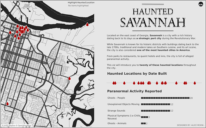
Haunted Savannah by Alice McKnight is based on one of the most haunted cities in America: Savannah, Georgia. The map used here shows historical buildings and the paranormal activities that have happened over time. The use of red blood droplets to mark locations helps accentuate the haunted theme of the map.
McKnight uses the blood droplets repeatedly throughout the dashboard to show the positions of haunted houses on the map and a timeline of incidents. She also created a bar chart to show the types of reported paranormal activities.
¡Latino Gang!
Tristan Guillevin featured the top ten Reggaeton artists and their musical collaborations in his ¡Latino Gang! dashboard. By highlighting the artists and visually linking them based on the artists they collaborated with, you’re able to see how the number of songs released per year was influenced by their collaborations. With this web of sorts, you’re also able to quickly assess the importance of their collaborations. For example, you can see that J Balvin appeared in 111 songs, collaborating with artists, including Ozuna, Farruko, and Karol G.
The heart of this dashboard is a CSV file containing the links between each artist. From this file, a graph of network connections is generated. When an artist is selected in the graph, a line chart shows the evolution of the number of songs released per year by that particular artist, and a bar chart shows the most productive duo based on the number of songs released together.

SpaceX vs Blue Origin
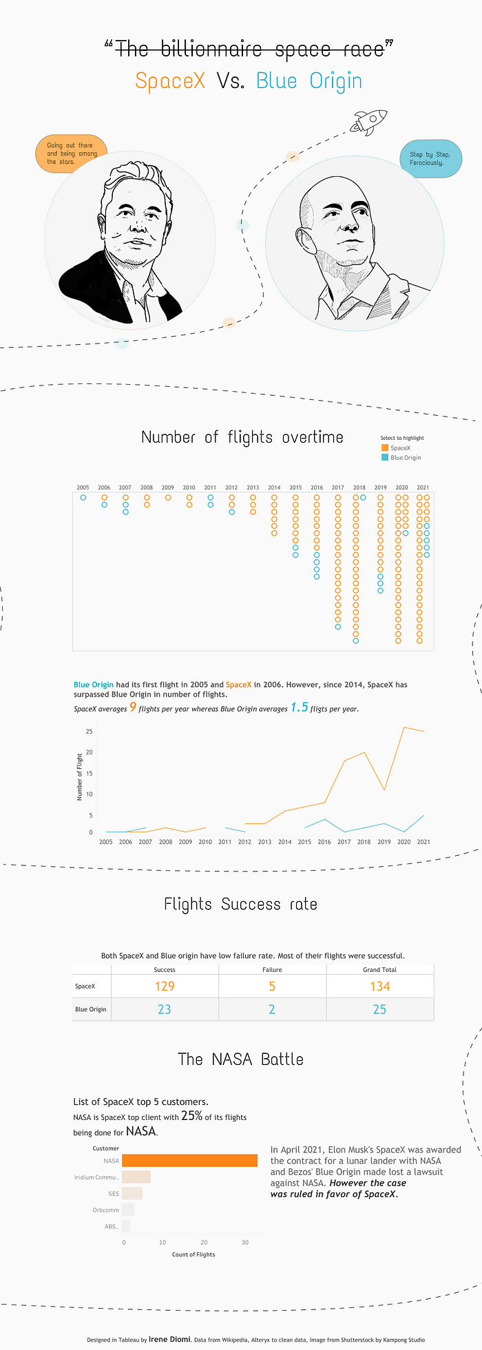
Space agencies are revolutionizing not only how the universe is seen but also what technologies are used. In SpaceX vs Blue Origin, Irene Diomi highlights the number of flights taken by Elon Musk’s and Jeff Bezos’s companies, SpaceX and Blue Origin, respectively.
A compelling and easy-to-read dashboard compares the two billionaires and their space agencies, showing a clear contrast between the number of flights taken over time. For instance, you can easily see how SpaceX overtook Blue Origin in the number of flights over time and even contracted with NASA for a lunar lander.
Circular shapes are used to generate a time-series graph of the number of flights over time, and an elegant line chart hosts the comparison of the number of flights per year.
Cinema Through Data: Chart Champ 2021
The movie industry, starting with silent films in the early 1900s, has grown exponentially to the booming industry known today. In Cinema Through Data, David Borczuk tells the story of how the movie industry has grown over time. He touches on several important periods for cinema, including the rise of Hollywood and the invention of television. David’s analysis skills are on full display in this dashboard. For instance, “The Rise Of TV and Beyond” features several prominent movies and shows, and how the number of films made during that time increased to over 11,000 as opposed to 569 in the Silent Era.
The dashboard employs a number of different types of charts throughout. Each section is accompanied by a map with markers that shows the locations of the films. Bar charts and line charts are used to compare the popularity and number of different films throughout history.

Travel Planner + Emissions Calculator
Have you ever wondered how much carbon emissions are released into the atmosphere when you travel with planes, boats, cars, or even bicycles? Marc Reid used Tableau to create an illustrative map, Travel Planner + Emissions Calculator, that calculates the emissions generated when you move from one city to another, based on your chosen mode of transportation.
This dashboard combines great visuals with a carbon emission calculator that shows you the distance between two places and calculates the carbon emission for various routes. Whatever transportation you take, you can see the impact you make on the environment.

Most Commonly Used Languages on the Internet
According to Vignesh Suresh and his Most Commonly Used Languages on the Internet dashboard, English is the most commonly used language.
The dashboard also shows that other languages, like Russian, Spanish, Turkish, Persian, and French, are widely used. From the visual Vignesh created, you can discover the ratio of native to non-native speakers of a particular language.
It’s also easy to see the dichotomy between the use of a language on the internet vs the percentage of people who speak it. For instance, even though 6.9 percent of the world’s population use Spanish, only 4 percent of the top ten million websites use it.

OUT FOR A RUN
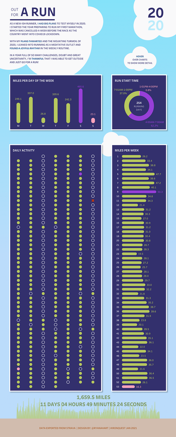
Unable to participate in his first marathon due to the COVID-19 pandemic, Ryan Hart took up a running challenge. He ran for a total of 1,659.5 miles and illustrated the number of miles he covered each day on his OUT FOR A RUN dashboard.
You can quickly glance at this dashboard and know what days he ran the longest distance. For instance, he usually took his longest runs on Saturdays and did less mileage on Sundays. The dashboard is colorful and visually appealing, and displays information that’s easy to understand.
Circular shapes are used to create a dot chart that explains his daily activity. Bar charts and donut charts are used to display miles run per week, miles run per day, and the starting time of each run.
Snowfall Extremes
From celebrating holidays to going ice-skating, there’s never a shortage of fun things to do during the winter. But in Snowfall Extremes, Agata Ketterick makes the point that snow is a little less fun when it comes in copious amounts.
The illustration shows eight counties in the US that have gotten over sixty inches of snow in one day. The info dates back to 1872, when the National Oceanic and Atmospheric Administration (NOAA) began tracking snowfall. For instance, the map shows you that Boulder County, Colorado, experienced a storm that left seventy-six inches of snow in 1921.

The Air We Breathe
Air is a necessity of life, and air quality depends on the contents of the air. The higher the concentration of pollutants in the air, the more danger it poses. Taking a look at the dashboard The Air We Breathe by Christian Felix, you can see how the quality of air differs over various countries and accentuates the global divide. Because of the use of colored lines pointing out what countries have good air quality vs bad, you can see that certain continents generally have better air quality than others. Christian also uses an interactive graph to show the connection between GDP and air quality.
Clever use of lines and bars on the map makes this interactive dashboard visually appealing. A scatter plot demonstrates how an increase in nominal GDP per capita improves air quality in cities around the world.

Sample Superstore — Sales Performance
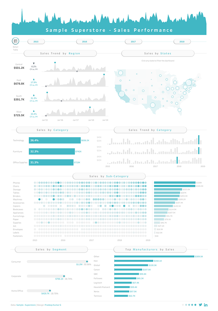
Sample Superstore — Sales Performance by Pradeep Kumar G addresses a few interesting questions, including what products sell more, in what regions, and to whom. Knowing what products sell to which set of people can help boost sales because you’re offering your products to those who want them most.
In this visual, Pradeep analyzes sales performance in various regions and from the highest-selling manufacturers, blending colors and analyzing data in different ways to show sales trends. For instance, in the “Sales by Category” graph, you quickly see that technology is the largest sales category and has increased 20 percent at the beginning of 2022 as compared to 2021.
Bar charts, line charts, and dot charts are used throughout the dashboard to show sales trends. The map uses a filled map overlay to display the sales trends in different states across the United States. Bubble markers are used to show the number of sales in a specific state.
Demand Forecasting
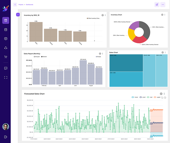
Demand Forecasting by Ikigai shows the sales numbers for four furniture items (CD41 — two-seat sofa, CD41E — three-seat sofa, CD51 — spring mattress, CD51E —foam mattress) in 2021. In these visuals, in addition to being able to see upper and lower bounds for the sales forecast, you’re able to quickly identify that foam mattresses are a top seller and that furniture sales increase throughout the year, hitting their peak in the month of July.
Different graphs are used in the dashboard to explain different segments. For instance, line charts are used for forecasting, pie charts for easy comparison, and bar charts for observing growth over time.
Conclusion
Tableau and Ikigai are powerful tools, but most users don’t understand the depth of customization available to them. In this roundup, you learned about eleven cool and unique dashboards, and what made each one special. Feeling inspired? Make your own dashboard at Ikigai today.
About the Author
Bunmi Akinremi
Bunmi is a Data Scientist and also an Android developer who’s interested in building apps with better user experience leveraging AI. She’s also interested in leveraging AI to solving environmental problems like plastic pollution in the oceans. She’s a passionate writer and mentor for those interested in getting into Data Science.
